A Brand New Opportunity
The NWP visual identity is a crucial part of our future. Not only does the brand influence a first impression, it also provides a powerful creative distinction that attracts attention, builds confidence and inspires progress. Our brand is a steady reminder about who we are and what sets us apart. While on the surface the logo and colour pallet immediately engage the eye, there is a far deeper connection to our history and path forward that are quietly reflected in this intentional design.
Conscious Connections
Clean and contemporary, our look has an edge. It reflects the values that underpin our priorities and provides a glimpse of what we see as core to our success – INNOVATION and RESPONSIVENESS. These values sum up how Northwestern Polytechnic will be valuable to our learning community now, and for years to come, as we strive to leverage potential and deliver an entrepreneurial advantage.
Purposeful Approach
At the heart of who we are is the importance of optimizing the internal and external forces that reveal an edge. We recognize that everyone has that something inside them. Whether you are straight out of high school and it’s just a tiny flicker, or you are decades into a life and now finally in a position to pursue your passion, Northwestern Polytechnic wants to stoke your success. We also understand that while everyone can be taught, there is a delicate balance of skill and will that differentiate. That’s why we are focused on building skills alongside the courage, confidence and commitment to rise to the top. Be it with our students, staff, faculty, alumni, donors or valued community partners, our core purpose is to spark and empower success.
Meaningful Mantra
The essence of who we are doesn’t need to be overly complex. With a clear purpose and values, we now know the opportunity associated with being in a space of our own choosing. Our purpose, to spark and empower success is perfect because it speaks to the action that can stoke success. Stepping outside of your comfort zone, seizing a moment, doubling down on a good idea or simply following your dreams, these things are accelerants for the entrepreneurial spark. At Northwestern Polytechnic we believe that there’s always time to carve a new path forward that pushes boundaries and takes you beyond. Beyond where you are today, and beyond where you’ve ever imagined you could go. Whether you are a next generation leader, industry champion, or bold adventurer, we see the tremendous value in people, and we are here to maximize that potential.
Enduring Commitment
Our institution has been part of northwestern Alberta for more than half a century. We’ve watched, contributed and been inspired by your progress and tenacity. And now we are evolving with you. We’ve never been clearer about who we are and where we are going. To that end, we will become the most entrepreneurial polytechnic in Canada by 2034. This aspirational goal is ambitious but is also absolutely achievable because our communities are rich with talent, resources and untapped potential.
Entreprenurial Energy
Northwestern Polytechnic is redefining the entrepreneurial spirit. We are instilling a mindset that extends beyond our classrooms and campuses, and even beyond the status quo. We want everyone to have the Confidence to turn risk into opportunity.
Lasting Imprint
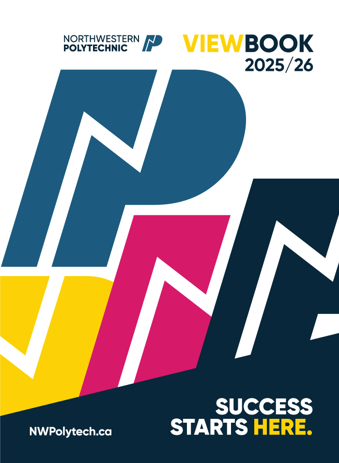
The Northwestern Polytechnic visual identity is equal parts unstoppable force and immovable object. Sturdy and steadfast, the strong ‘P’ letterform represents an institution galvanized by industry, technology, innovation and the people of northwestern Alberta. Running through this forward-leaning and powerful character is an ‘N’ letterform that conveys the kinetic energy with which we work to find entrepreneurial solutions to make the Northwest a bright beacon on Canada’s post-secondary map. This line element captures the excitement of the future along with the boldness of being on the lead edge of opportunity.
Vivid Future
Our colour palette has been carefully selected to complement our approach. Each element impresses our distinct regional advantages.
Bolder
A steady base to launch courageous pursuits
Aspire
Unbounded opportunity and potential
Aurora
Power of connection
Vibrant
Energy to achieve
The dark bolder blue represents the strong foundation on which we are building. this colour is essentially the bedrock of most design pieces, providing consistency and strength.
Used less frequently, the lighter aspire blue gives the breath for ideas and people to be uplifted. Within the bold blue palette, lay flashes of colour that not only tell the technological side of the story but also reflect the diversity and vibrancy of northwestern Alberta.
The aurora pink highlight the enduring linkage between people and places. this element can be used in designs that are geared to community-building, events and creative scholastic pursuits. it should help drive home the spirit of community, collaboration and creativity.
The Vibrant yellow captures the energy for achievement. Often associated with joy and intellect, this is the colour that lights the spark and empowers success. Bold and bright, it can also serve as a visual storyline in marketing and promotional tools, linking the visual identity to specific calls to action.


